
Whether you're refreshing your brand or starting from scratch, Define Digital will help you choose a palette that performs for conversions, not just one that’s pretty.
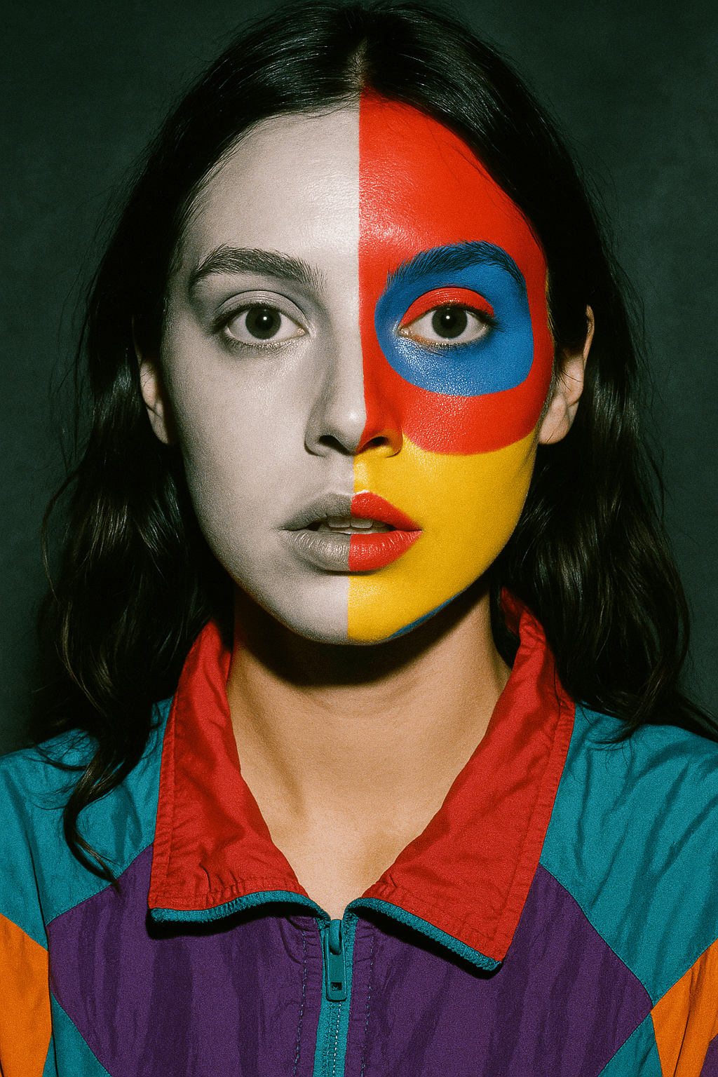
Color isn’t just about looking good. It’s a strategic decision that shapes how your brand is perceived, remembered, and emotionally experienced. In a world where attention spans are short and brand loyalty is hard-won, the colors you choose can influence everything from first impressions to conversion rates.
So how are successful brands using color to their advantage? And how can you?
Color is Emotional and Strategic
Studies have shown that people form an impression of a brand within 90 seconds, and as much as 90% of that judgment is based on color alone. That’s not a design opinion. That’s human psychology.
Before a customer reads a word of your copy or interacts with your product, their brain is already forming emotional associations. Color is the first layer of that connection.
For example:
Red creates urgency, energy, and excitement
Blue suggests trust, calm, and stability
Black conveys sophistication, power, and luxury
Green connects to wellness, nature, and growth
Yellow feels optimistic, energetic, and clear
Purple hints at creativity and premium quality
Orange brings out playfulness and boldness
White signals cleanliness, minimalism, and simplicity
Of course, context is everything. These meanings shift based on culture, industry, and the overall brand tone.
How the Best Brands Use Color Intentionally
Coca-Cola owns the color red. It’s not just about appetite stimulation. It’s about commanding attention and creating lasting emotional energy.
Spotify stands out by choosing green in a sea of tech brands dominated by blue. It immediately feels different, more creative, more free.
Tiffany’s iconic robin egg blue is a masterclass in association. That specific shade isn’t just a color anymore. It’s a brand memory, instantly linked to elegance and exclusivity.
Dropbox blends fun, friendly illustrations with a blue palette that reinforces trust and tech-savviness. That balance is no accident. It’s strategy through color.
One Size Doesn’t Fit All
Color psychology doesn’t work in isolation. It has to be filtered through the lens of your industry, your audience, and your message.
Finance and SaaS brands often lean into blues and greys to feel stable and trustworthy.
Wellness brands gravitate toward earth tones and pastels to evoke calm and authenticity.
Food and beverage brands typically go bold with reds, oranges, and yellows that trigger hunger and excitement.
Luxury brands keep it refined. Think black, gold, and deep neutrals. These choices aren't random. They are carefully designed to trigger emotion and trust at a glance.
Even geographic and cultural factors affect how colors are received. Red may mean “danger” in the West, but it's a symbol of luck and celebration in much of Asia.
Consistency Builds Recognition
Your color palette isn't just for first impressions. It helps create lasting ones.
When your color scheme is consistent across your website, packaging, social media, and ads, it becomes a visual anchor for your audience. A consistent color identity increases brand recognition and recall. In fact, consistent branding has been shown to boost revenue by up to 33%.
Consistency doesn’t mean boring. Smart brands know how to evolve their palette across different channels without losing cohesion. Gradients, accent shades, and seasonal tweaks can keep things fresh while reinforcing the core brand identity.
Color That Converts
Color also plays a direct role in conversion optimization.
The right color can increase visibility, improve click-through rates, and guide the user’s eye toward key actions.
Red buttons work well when urgency matters. Blue buttons often perform better for subscription or lead capture because they feel calm and trustworthy.
But the real secret lies in contrast. High-converting designs are usually less about picking the "right" color and more about making sure key elements pop in the right way, in the right context.
Helping You Get it Right
This is exactly the kind of work we do during our strategy calls. We don’t just help you pick colors that look good. We help you define a palette that evokes the right emotional response for your audience. Every shade has a job to do, and when chosen intentionally, it moves your customer one step closer to action.
Whether you're building a new brand or evolving an existing one, we’ll guide you toward choices that align with your business goals and create a visual identity that feels right and performs even better.
Final Thought
Color has the power to influence, to persuade, and to connect. It can help your brand feel trusted, loved, understood—or ignored entirely.
If you want your brand to stand out, be remembered, and drive results, don’t treat color as a design afterthought. Make it part of your strategy from day one.
The brands that do this well don’t just get seen. They get chosen.
Chat with us

Let’s keep in touch.
Want to explore what high-performance digital strategy looks like? Click the button below to connect with us.
Chat with us